Next up
Media library
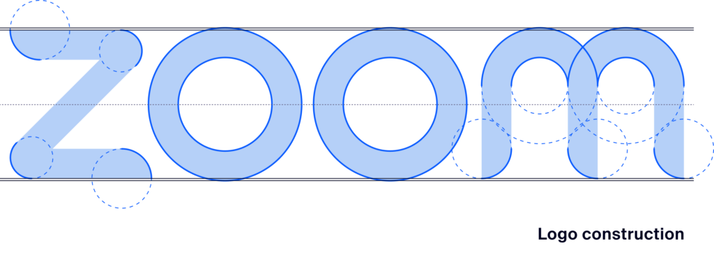
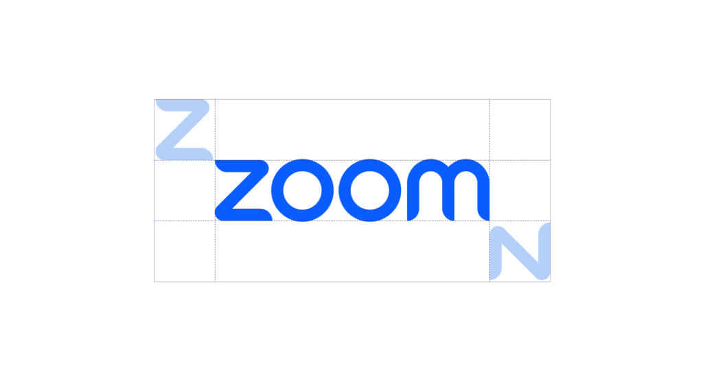
The Zoom logo is at the center of our visual identity. This core component informs how so much of our design system looks and behaves.
We have retained the unique rounded-tapered ends of the strokes, but have revised each letter form to feel continuously flowing, geometrically constructed, and optically balanced.

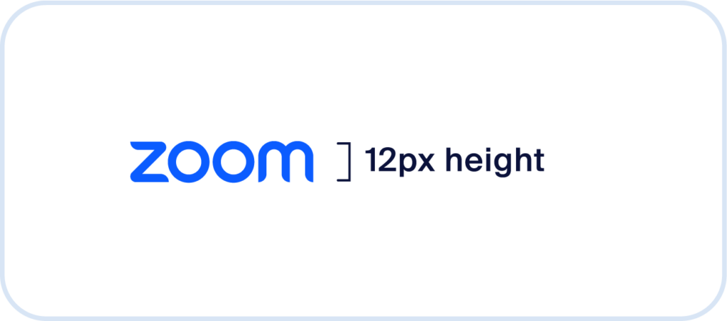
Minimum size, digital
For screen content, the wordmark’s height should be equal to or greater than 12 pixels.
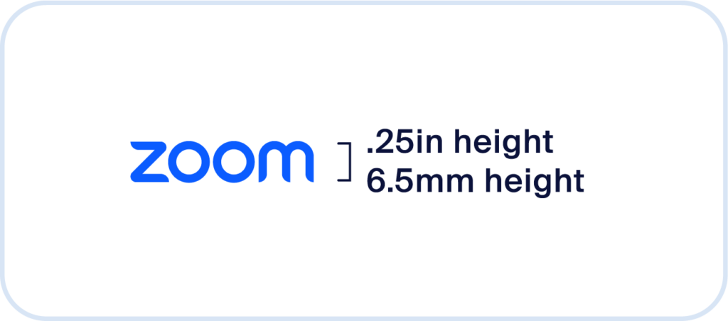
Minimum size, print
For all physical or printed content, the wordmark’s height should be equal to or greater than .25 inches or 6.5 millimeters.
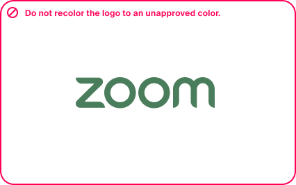
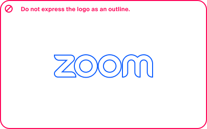
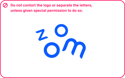
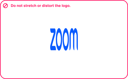
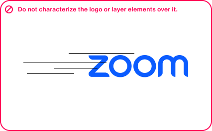
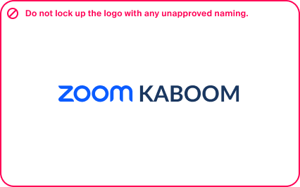
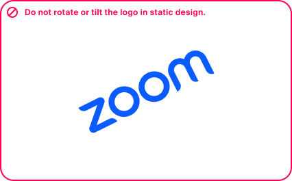
The wordmark was designed with intention, it is important to ensure we are intentional with how we use it. Here are a few examples of incorrect uses of our logo.
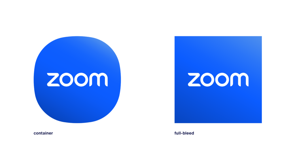
Our company icon, or “logomark,” is simply our wordmark within a shape container. At small sizes, we shorten our wordmark to simply a ZM, creating our company favicon.
Note: the legacy camera icon is no longer approved for company representation. It has been reserved for the Meetings product only.
Happy Display is our brand new custom-designed display typeface. It is intended for headlines and large-scale typography and is meant to evoke a sense of friendliness and approachability while feeling trustworthy and professional.
Happy’s expressive character adds personality to our messaging and the design of its letterforms allows us to communicate clearly and effectively. It’s large, open counters and tall x-heights ensure a high level of legibility and make it perfect for both screen and print applications. Happy Display is available in 7 weights (roman and italic).
7 Weights

Almaden Sans is our secondary typeface and is intended for smaller typographic applications and body copy. It’s clean design and many weight variations provide a solid typographic foundation to create typographic layouts that are highly legible, easy to read, and well-balanced.
9 Weights

Following our typographic guidelines will enable you to create thoughtful hierarchies that are reflective of our brand.
Almaden Sans
Semi Bold (600)
SMALL EYEBROW COPY
Happy Display
Semi Bold (600)
Headline titling
Happy Display
Regular (400)
Subhead
Almaden Sans
Bold (700)
Paragraph titling
Almaden Sans
Book (400)
Body copy lorem ipsum dolor sit amet, consectetur adipiscing elit, sed do eiusmod tempor incididunt ut labore et dolore magna aliqua. Ut enim ad minim veniam, quis nostrud exercitation ullamco laboris nisi ut aliquip ex ea commodo consequat. Duis aute irure dolor in reprehenderit in voluptate velit esse cillum dolore eu fugiat nulla pariatur. Excepteur sint occaecat cupidatat non proident, sunt in culpa qui officia deserunt mollit anim id est laborum.
Almaden Sans
Medium (400)
Captions and labels
Almaden Sans
Bold (700)
Buttons and standalone links
In the event that our brand fonts are unavailable, they can be substituted with the widely accessible fonts Montserrat and Inter. Follow these general guidelines to establish a hierarchy that is effective and reflects our brand.
Typographic substitutions
When brand fonts are unavailable
Inter
Semi Bold (600)
SMALL EYEBROW COPY
Montserrat
Semi Bold (600)
Headline titling
Montserrat
Medium (400)
Subhead
Inter
Bold (700)
Paragraph titling
Inter
Regular (400)
Body copy lorem ipsum dolor sit amet, consectetur adipiscing elit, sed do eiusmod tempor incididunt ut labore et dolore magna aliqua. Ut enim ad minim veniam, quis nostrud exercitation ullamco laboris nisi ut aliquip ex ea commodo consequat. Duis aute irure dolor in reprehenderit in voluptate velit esse cillum dolore eu fugiat nulla pariatur. Excepteur sint occaecat cupidatat non proident, sunt in culpa qui officia deserunt mollit anim id est laborum.
Inter
Medium (500)
Captions and labels
Inter
Bold (700)
Buttons and standalone links
In situations where additional language support is required, the widely available font Noto Sans may be used in addition to Happy Display and Almaden Sans. Refer to our Brand Guidelines for language specific font pairings to create a typographic composition and hierarchy that is effective and aligns with our brand.

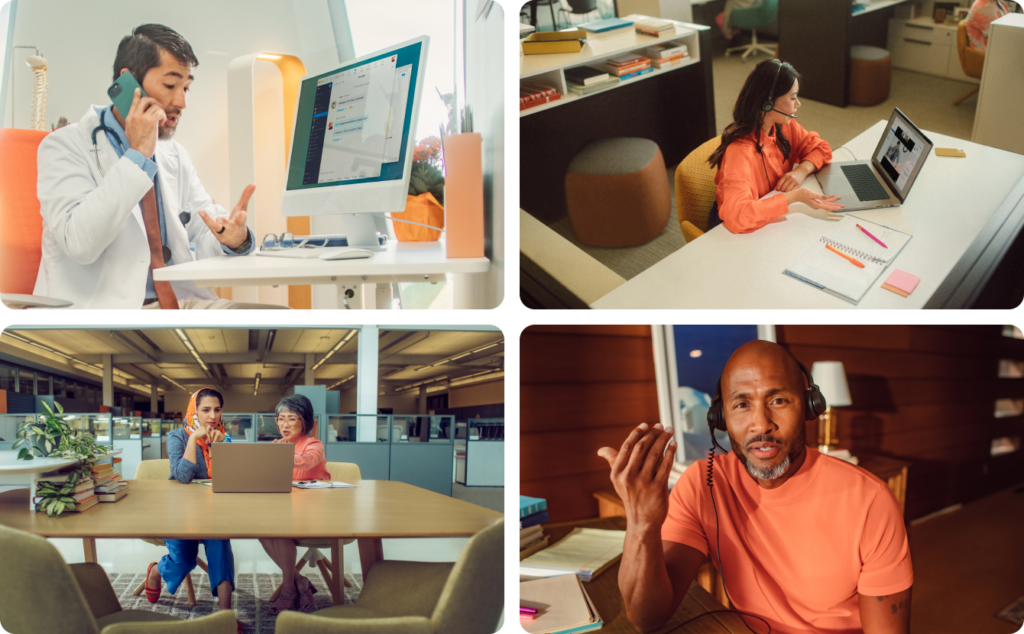
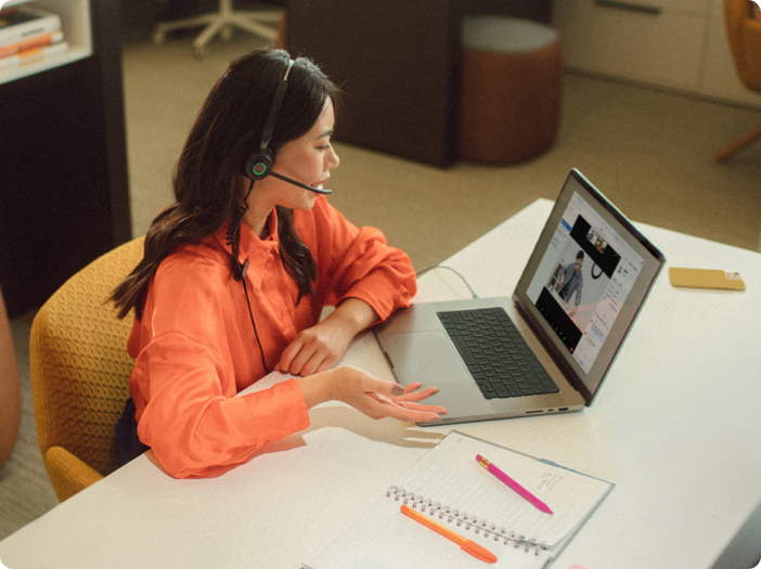
Our new photography style is built on the principle of showcasing Zoom products in cinematic, natural-feeling ways. The moments should feel real, relatable, and feature talent that looks like someone you might see in your place of work. We try to use several points of view, ranging from wide, establishing photographs that show a sense of place, down to the view a camera sees while people interact with Zoom products.
We tend to stay away from overly-produced, disingenuous moments, like the use of a studio backdrop or unrealistic setpieces. The use of that style is reserved for ad campaigns and other highly art directed use cases.
We categorize our photos into four different subject styles. These help us consider the story of our images and how they help showcase the Zoom platform.
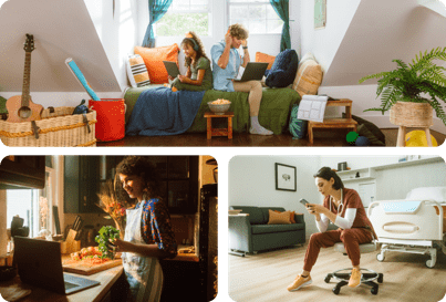
Places
Environments that portray authentic, lived-in place unique to the industry or use case.

Experiences
Compositions that feature devices front and center to highlight the UI of our product.

Camera POVs
Images taken from the perspective of the device screen, highlighting human interaction. Often used for mockups.
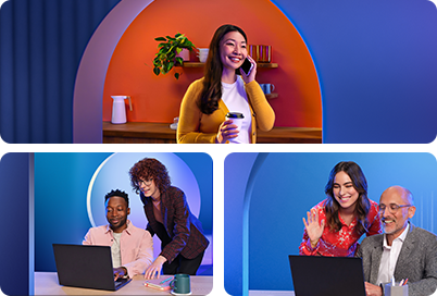
Stylized
Portraits of people interacting with products in clean, minimal, and rich environments.
Reference the following tips to ensure the photos you create or find follow an appropriate look and feel.
Camera direction
Art direction
Talent direction
Avoidances
Core colors represent the building blocks of the Zoom brand. These are the colors that can be universally used for any purpose and comprise of the majority of the Zoom content. Bloom should always be considered the primary color for all content.
Bloom
HEX: 0b5cff
RGB: 11, 92, 255
CMYK: 83, 63, 0, 0
PMS 2727 C
Bloom is the primary brand shade and should be considered the main color for all Zoom branded content
Midnight
HEX: 00053d
RGB: 0, 5, 61
CMYK: 100, 93, 38, 57
PMS 2965 C
White
HEX: ffffff
RGB: 255, 255, 255
CMYK: 0, 0, 0, 0
PMS NA
1:00
HEX: f7f2e3
RGB: 247, 242, 227
CMYK: 2, 3, 11, 0
PMS P 1-9 C
Bloom 020
HEX: b5d0f8
RGB: 181, 208, 248
CMYK: 30, 11, 0, 0
PMS 2717 C
Please note that some of the accent color are currently associated to specific Zoom products and they should be paired accordingly to the related content:
Agave
HEX: 00deef
RGB: 0, 222, 239
CMYK: 100, 8, 0, 7
PMS 311 C
Spearmint
HEX: 00ef9d
RGB: 0, 239, 157
CMYK: 100, 0, 35, 7
PMS 7479 C
Gold
HEX: ffcd00
RGB: 255, 205, 0
CMYK: 0, 20, 100, 0
PMS 116 C
Lavender
HEX: 9a67fb
RGB: 154, 103, 251
CMYK: 39, 59, 0, 2
PMS 265 C
Saffron
HEX: ff7900
RGB: 255, 121, 0
CMYK: 0, 53, 100, 0
PMS 151 C
Rose
HEX: fb327e
RGB: 251, 50, 126
CMYK: 0, 81, 50, 2
PMS 1915 C